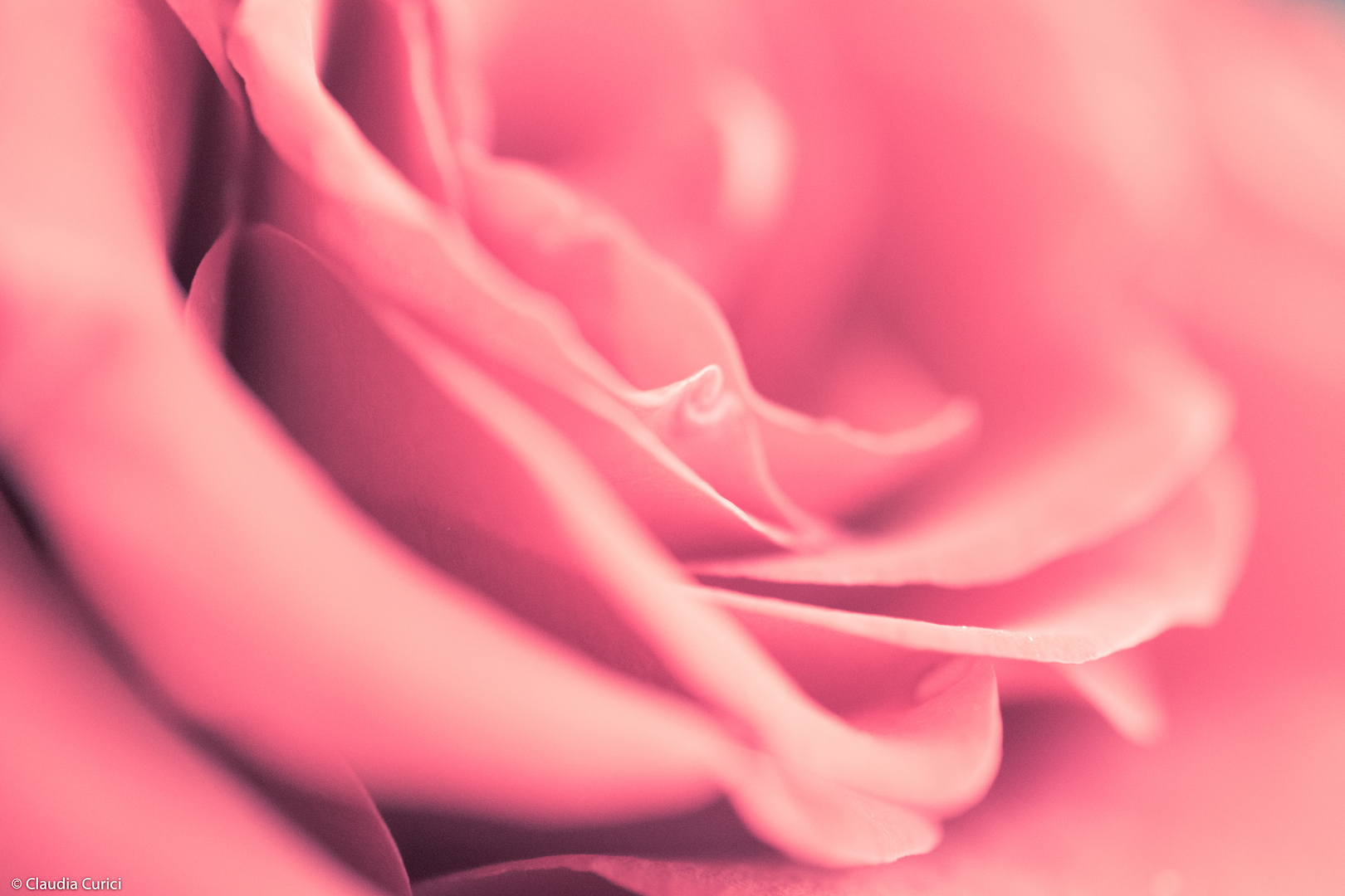
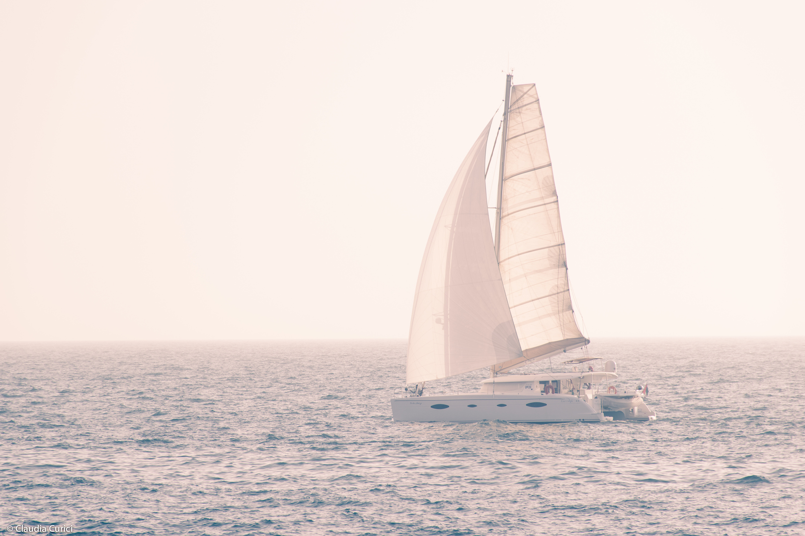
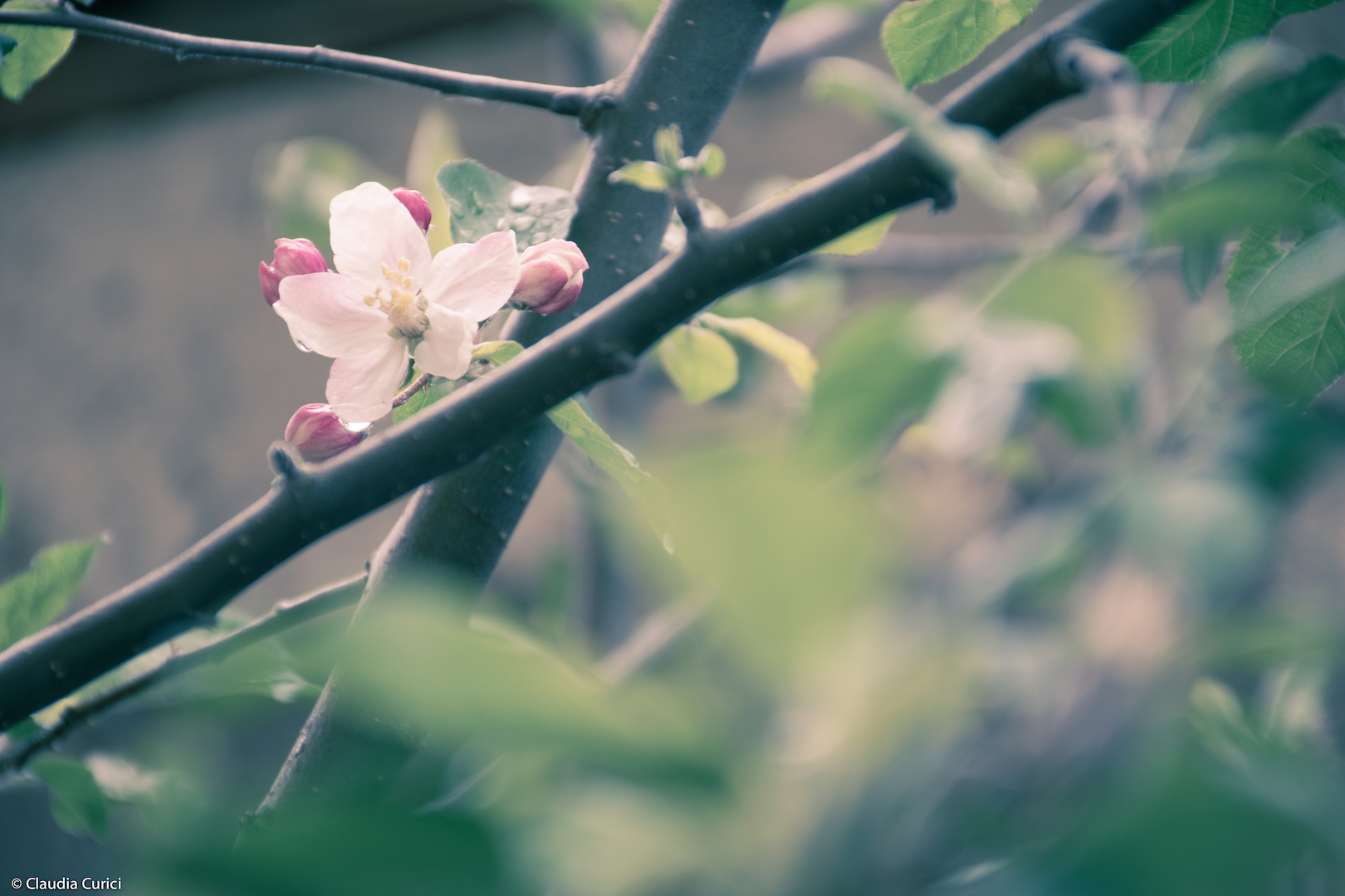
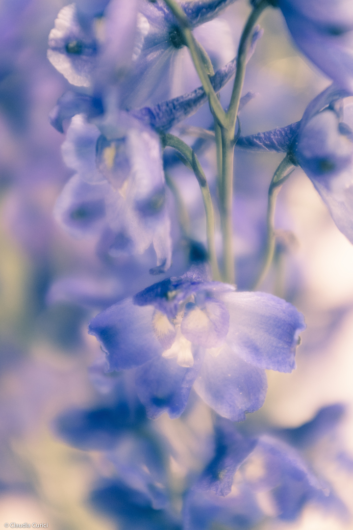
Soft pastels
Eureka! Finally I’ve managed to create my own preset for soft pastels. Until today I couldn’t figure out how to get this look for some of my photos but a simple goole research shed some light on what settings I needed to play with. I’m not going to get into too much details, but for those who have the same problem this is pretty much what needs to be played with (I’m not gonna say the values as each has their own preference): increase (plus values) exposure, contrast, highlights, shadows, blacks. Decrease (minus value) clarity, vibrance, saturation. In Split Toning, slightly increase hue and saturation for highlights (below the mid value), and increase hue and saturation for shadows (above the mid value). Tone Curve, slightly increase shadows (this one I still need to work a little bit with). I noticed there are many Lightroom presets available to buy online, but I feel like I’d make it too easy if I’d buy them ready.
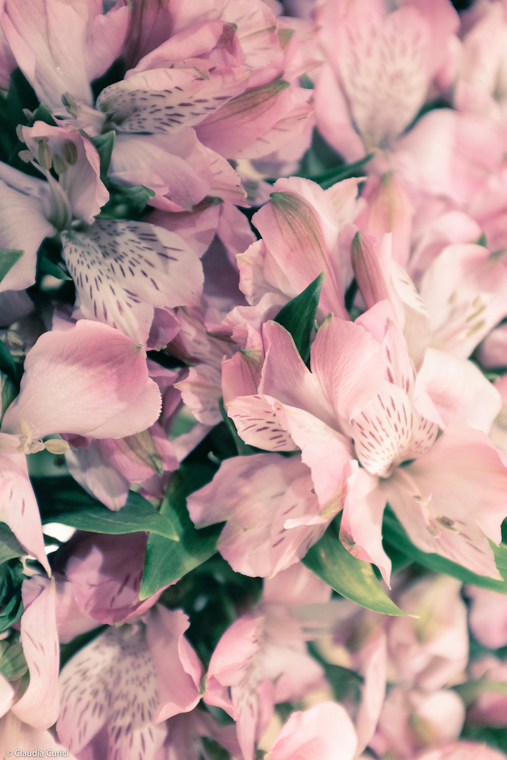
Few of the photos I applied the soft pastels preset on:


Your presets go very well with flowers. I think we have over saturated them in digital processing.
LikeLike